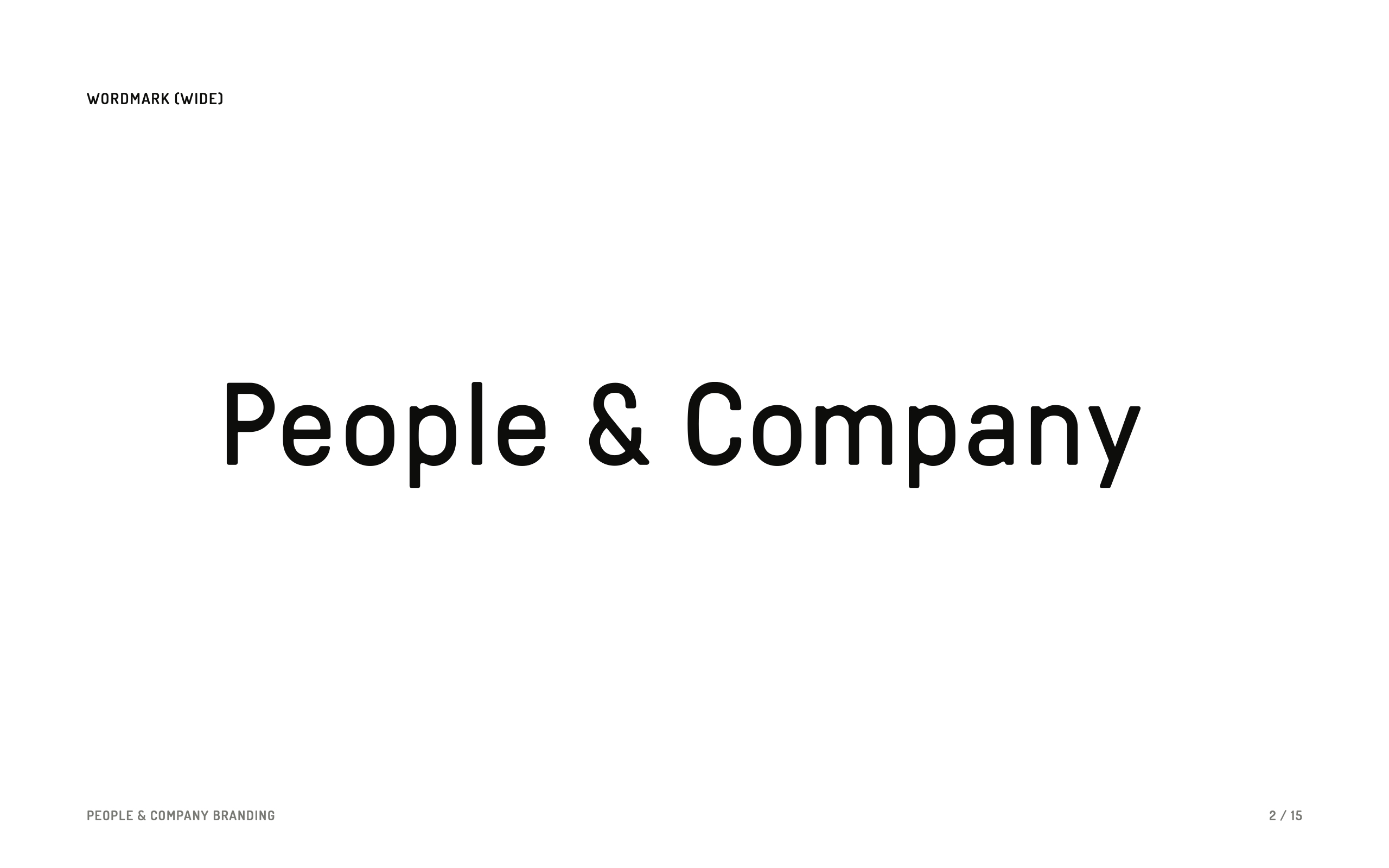
I’m still proud that I was in the room when Kevin and Bailey came up with the name “People & Company.” We were sitting in our living room, tossing around ideas. Our good friend Sally was there, too. It feels like ages ago!
Not long after, it was decided that I would develop the logo and branding. I knew from past experience that I wanted the process and the delivery to be lightweight and unfussy; I’d seen enough multi-page’d brand guidelines with rules about clearance and lockups and DO THIS, NOT THIS! Not that those don’t have a place in the world, it just seemed over the top for a three-person company that was just getting started and figuring stuff out. Plus, working with friends … I wanted it to be fun, not full of rules.
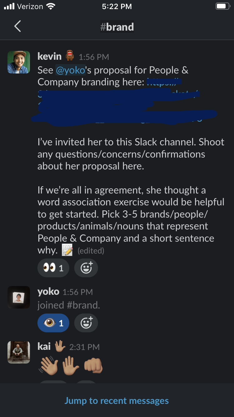
So I started with a word assocation exercise. I already knew Kevin pretty well (is it too late in this post to mention that we had just become domestic partners?), but I had just met Bailey and I don’t even think I had met Kai yet, since he lives in Singapore and all.
I got a bunch of wonderful inputs:
Grandmaster Flash: He invented a new type of music by being resourceful and blending old things together. And he used to DJ in the streets in New York — bringing people together in an accessible way.
I don’t want to feel perfectly polished. I want to feel honest. To feel like us more than feel like perfection.
[Referencing a photo, not shown, of Bailey and Kai participating in a tire-rolling race with a bunch of kids while in the Phillipines for a shoot] We are there to work. We also played. We participated. We were invited. We got dirty, sweaty. The smiles, laughs, and camaraderie. We were playful but we also had a purpose.
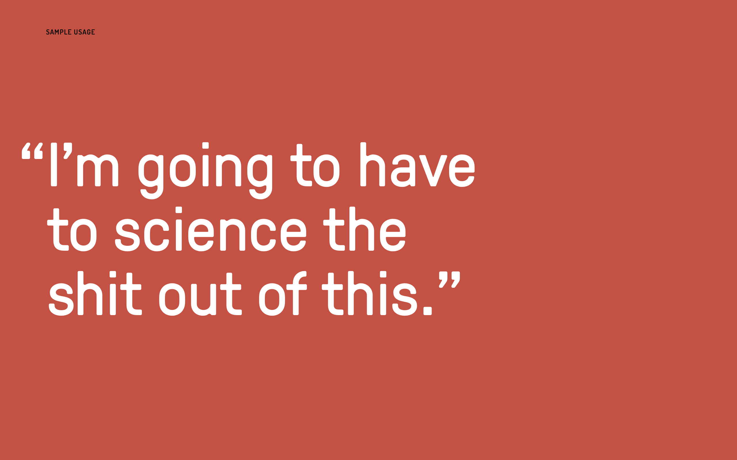
The Martian: Heavy on the science/nerd fiction but also heavy on the human survival story. Levity amidst relentless problemsolving, never shying away from the real constraints of the situation.
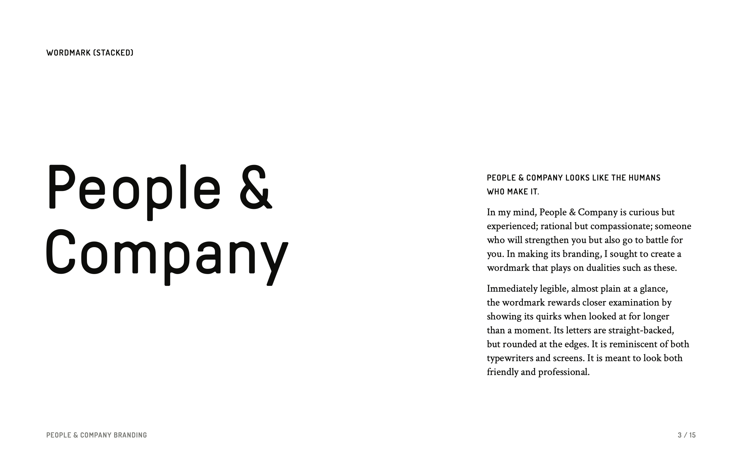
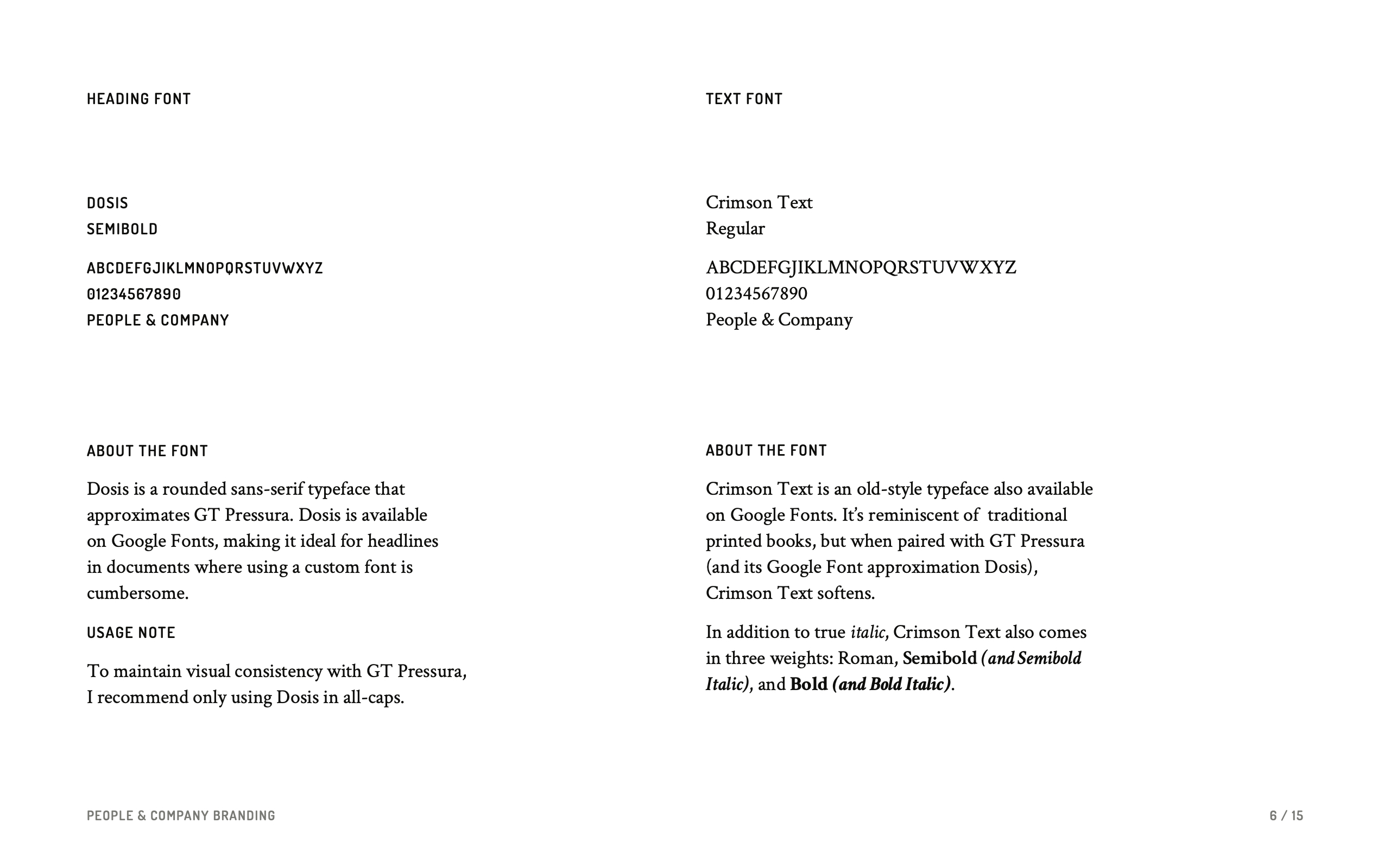
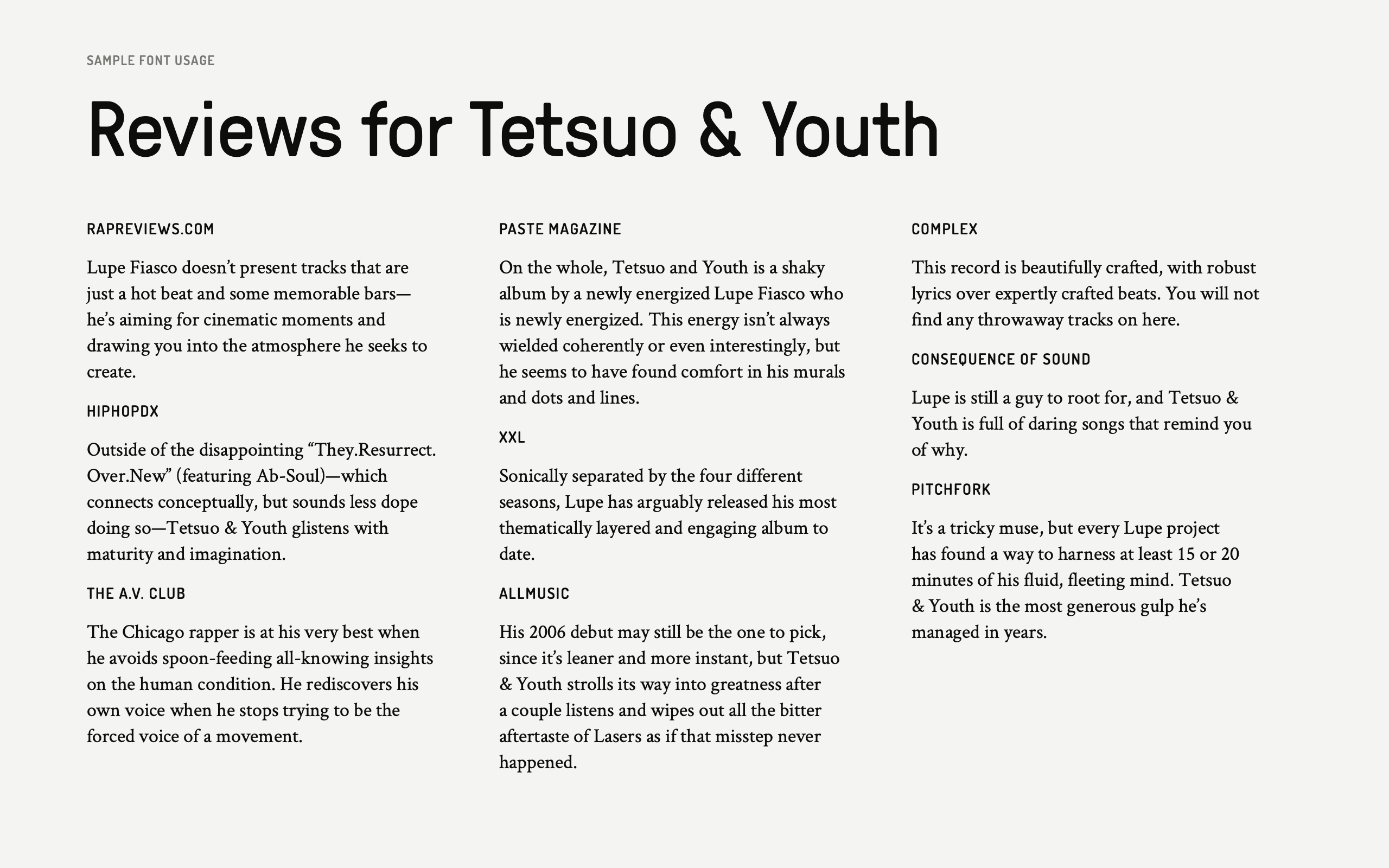
I wanted the guidelines to feel actionable; I used the swoon-worthy Pressura by Grilli Type for the wordmark and logos, but I didn’t think it was realistic to expect Pressura to make it into the documents, decks, and website pages where the company will really live and express itself. So I sought a Google Font that came close enough (Dosis by Impallari Type) and a complementary serif (Crimson Text by Sebastian Kosch) that would be better used for body text.

I admit that my color selection was mostly influenced by Kevin’s sartorial aesthetic, but I liked the idea of primary colors being the foundation off which all other colors are created. Remixing of the old to create the new, ya know? Slightly adjusted to be more bright and modern. I gave them fun names: “Grandmaster Red” “Empathy Gold” “Dolphin Blue.” Concepts!!!
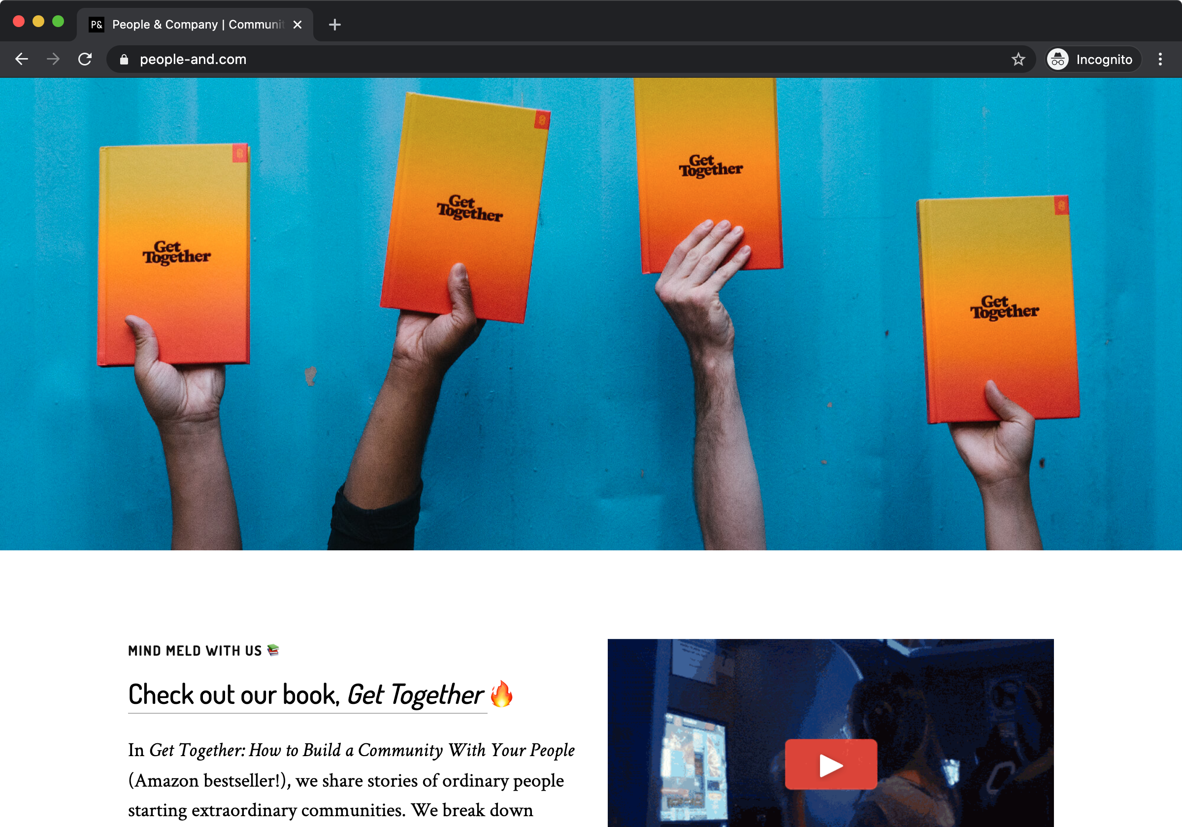
By the way, a couple years later, People & Company wrote an Amazon bestselling book about cultivating communities! I didn’t design it, but you should still check it out.
This post was retrospectively written in May 2020.